What Is a Rentry Divider? The Ultimate Guide to Pink, Black, Blue & More Aesthetic Styles
A clean Rentry page feels easy to follow, while a cluttered one feels hard to scan. That difference often comes down to one simple tool: the divider. A Rentry divider is a visual line, graphic, or decorative element that separates sections on a Rentry page to improve structure, clarity, and style. It breaks up text, highlights new topics, and gives a page a polished look.

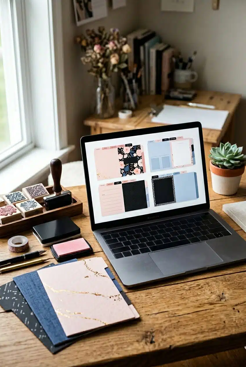
They come in many styles, from simple black lines to soft pink lace, bold blue bars, and detailed themed graphics. Some creators use minimal designs for a clean layout, while others choose cute or aesthetic dividers to match a mood. These options help shape the tone of the page without changing the content itself.
You can find dividers through resource pages, graphic collections, and community posts that share PNGs, pixels, and stamps. When used with care, they organize content, support accessibility, and create a layout that feels intentional instead of random.
Defining Rentry Dividers and Their Core Purpose

Rentry dividers are visual elements that separate sections on a Rentry page. They help organize content, improve readability, and support a specific aesthetic such as pink, black, or blue themes.
What Sets Rentry Dividers Apart
Rentry dividers are built for the Rentry.co platform, which uses Markdown and simple formatting tools. Users insert them as text symbols, styled lines, or image files such as a divider PNG or rentry PNG.
Unlike basic horizontal rules, rentry dividers often match a theme. For example, a user may choose soft pink lines for a cute layout or bold black bars for a minimal page. This focus on visual style sets them apart from plain website separators.
Many creators share divider PNG files and code snippets as part of a larger rentry resource collection. These resources may include:
- Copy‑paste line dividers made from symbols
- Image-based divider PNG files
- Themed packs grouped by color (pink, blue, black, etc.)
- Matching icons, pixels, and other layout graphics
Because Rentry pages are often used for profiles, link hubs, or resource lists, the divider plays both a structural and decorative role.
How Dividers Structure and Enhance Online Content
Dividers break long blocks of text into clear sections. This makes the page easier to scan and understand.
When a user adds dividers between topics, readers can quickly find headings, lists, or key links. The divider acts as a visual pause. It signals that one idea has ended and another has begun.
Dividers also support hierarchy. For example:
| Use Case | Purpose |
|---|---|
| Between major sections | Separate main categories |
| Above link lists | Highlight important resources |
| Under titles | Emphasize headings |
| Around quotes or notes | Draw attention |
A well-placed rentry divider reduces clutter. It keeps layouts clean, especially when a page includes many links, rentry resources, or embedded graphics.
Without dividers, dense text can blend together. With them, the page gains structure and balance.
Popular Types and Styles
Rentry dividers appear in several common formats. Each style serves a different visual goal.
1. Text-Based Dividers
These use repeated symbols or characters, such as lines, stars, or decorative marks. They load fast and work well in simple layouts.
2. Image Dividers (Divider PNG / Rentry PNG)
These are small graphic files. Many come in soft colors like pink and blue, or neutral tones like black and gray. Users upload or link to them directly in Markdown.
3. Themed Aesthetic Sets
Some creators build full rentry resource packs. These include matching dividers, icons, blinkies, and pixels. Color categories often include:
- Pink
- Black
- Blue
- Red
- Green
- Multicolor
These styles allow users to keep a consistent look across the entire page. A clear, repeated divider design helps the layout feel organized instead of random.
Exploring Aesthetic and Color-Themed Divider Options

Color changes how a page feels and how readers move through it. A well-chosen divider does more than split text; it sets tone, guides attention, and supports the page theme.
Pink Dividers: Soft, Playful & Kawaii
A pink divider creates a soft and friendly look. Many users choose pink dividers for journals, fan pages, and cute profile layouts.
Light pink works well for pastel themes. It pairs with white backgrounds, small pixel graphics, and simple heart or lace symbols. This style appears often in kawaii and “soft girl” designs.
Darker pink shades add contrast. They help section off headers, quotes, or image galleries without feeling harsh.
Common pink divider styles include:
♡ ─── ♡ ─── ♡୨୧ ── ୨୧ ── ୨୧- PNG lace or ribbon lines
- Pixel heart borders
Pink dividers stand out best when the rest of the layout stays simple. Too many bright graphics can make the page look crowded.
Blue Dividers: Calm & Versatile Uses
A blue divider gives a clean and calm look. Many creators use blue dividers for study notes, resource lists, and tech-related pages.
Light blue feels soft and organized. It works well with white or light gray backgrounds. Navy blue creates stronger contrast and fits minimal or dark themes.
Blue dividers often use:
- Straight lines with small star or dot symbols
- Wave patterns for ocean themes
- Simple Unicode lines like
─── ✦ ───
Blue dividers help separate long guides into clear sections. They also support accessibility because darker blue text and lines are easier to read than very pale colors.
When used with matching headers, blue dividers make the page feel structured. They guide the reader’s eye without drawing too much attention.
Red Dividers: Bold Accents and Attention Grabbers
A red divider adds strong visual contrast. It works best when the page needs clear breaks or warning-style emphasis.
Red draws attention faster than softer colors. Creators often use red dividers to mark:
- Important notes
- Content warnings
- Rule sections
- Updates or changes
Bright red fits bold themes. Dark red, like burgundy, feels more formal and controlled.
Because red stands out, users should limit how often they use it. Too many red dividers can make the page feel tense or busy.
Simple designs work best. A clean red line or a small symbol pattern keeps the focus on the text instead of the decoration.
Green Dividers and Other Popular Colors
A green divider often supports nature, gaming, or eco-themed pages. Light green feels fresh and soft. Dark green gives a grounded and stable look.
Green dividers pair well with:
- Leaf or vine symbols
- Minimal straight lines
- Earth-tone backgrounds
Beyond green, users also explore purple, black, and pastel sets. Black dividers create strong separation on light pages. Pastel mixes blend well in aesthetic layouts.
When choosing any color, the creator should check contrast. The divider must stay visible without overpowering the content.
Color-themed dividers work best when they match the page goal. The shade, thickness, and symbol style should support the message instead of distract from it.
Creative Elements and Supplementary Graphics

Rentry layouts often use more than a single line divider. Designers mix lace, ribbons, borders, pixels, gifs, and PNG graphics to shape the full look of a page.
Lace Dividers, Ribbon Dividers, and Cute Variations
A lace divider adds a soft edge between sections. It often uses white, black, or pastel tones with small loops or scallop shapes. This style fits pink, blue, or light-themed pages that focus on a gentle or vintage look.
Ribbon dividers create a clean horizontal break. They often look like a folded strip with pointed ends. Many users pick solid colors such as black or dark blue to contrast with a light background.
A cute divider may include hearts, stars, bows, or small icons. These often appear as a divider PNG with a transparent background. Transparent files help the graphic blend into any page color without a visible box around it.
When choosing between lace, ribbon, or cute styles, the key factors include:
- Background color
- Text size and spacing
- Theme consistency
They should support the layout, not distract from the text.
Borders and Frames for Enhanced Design
Borders define the outer edge of a section or the full page. A thin black line creates structure, while a dotted or pastel border feels softer. Designers often match border color with their main divider for visual balance.
Frames work well for profiles, quotes, or image blocks. A simple rectangular border keeps the page organized. Decorative frames, such as lace-style edges, add detail but require careful spacing.
When adding borders, spacing matters. Text should not touch the edge. A small margin keeps the layout readable.
Many users pair a border with a divider PNG to separate major sections. This combination creates clear structure:
- Border = outer boundary
- Divider = section break
Used together, they guide the reader’s eye without clutter.
Using Pixels, Gifs, and Pngs in Rentry Layouts
Small pixels add detail without taking much space. These tiny graphics often repeat in a line to act as a divider. Pixel hearts, stars, or themed icons are common in aesthetic layouts.
GIFs introduce motion. A blinking star or moving ribbon can highlight a section title. Designers should use GIFs in moderation. Too many animated elements slow loading and distract from content.
A PNG file works best for clean placement. Transparent PNG graphics layer smoothly over colored backgrounds. They also allow users to link images if needed.
Popular graphic types include:
- Pixel dividers for subtle breaks
- Cute divider PNG files for themed pages
- Short, looping GIFs for accents
Each element should serve a clear purpose. The layout stays readable when graphics support the text instead of overpowering it.
How to Access and Use Dividers, Stamps, and Decorations
Users can find free graphics through trusted rentry resources and image archives, then place them into their bios with simple copy-and-paste code. Clear credit rules and clean layout choices help pages look organized and readable.
Finding Free and Credited Divider Resources
Many creators share free dividers, stamps, and other small graphics through organized resource pages. Some rentry resources list pixel dividers, webcore backgrounds, and Y2K-style decorations in one place. Archive sites such as Deco Hoard also collect banners, stamps, favicons, and pixel art for easy browsing.
When using these resources, users should always check the credit rules. Some pages allow free use with no credit, while others require a link back to the creator. A short credit line at the bottom of a bio keeps things clear and respectful.
To stay organized, users can:
- Bookmark trusted resource pages
- Save images in labeled folders (e.g., pink dividers, blue stamps)
- Keep a note with creator names and links
This simple system saves time and avoids broken links later.
Incorporating Blinkies, Stamps, and Buttons
Blinkies, stamps, and buttons add personality to a rentry page. A blinkie is a small animated graphic, often 150×20 pixels. A stamp is usually a wider badge-style image. A button often looks like an old 88×31 web badge.
Users can upload the image to an image host, then insert it with basic image syntax in their bio. They should test the preview to confirm the image loads correctly and does not stretch.
Placement matters. A row of stamps works well under a divider. Blinkies fit best between short text blocks. Too many animations in one area can distract from the text, so spacing is important.
Simple structure helps:
- Divider
- Short bio text
- Row of stamps or buttons
- Another divider
This pattern keeps the layout clean and easy to scan.
Customizing Bios and Layouts With Decorative Assets
Decorative assets shape the tone of a bio. Pink lace dividers create a soft look. Black line dividers feel minimal. Blue pixel borders give a calm style. Users should choose one main color theme and repeat it across dividers, stamps, and buttons.
They should also match graphics to the content. A music-focused bio may include band stamps. A retro theme may use webcore blinkies and old-style buttons.
Spacing improves readability. Users can add blank lines between images and text so the page does not feel crowded. They should avoid stacking large images without breaks.
Before publishing, they should check:
- Do images load correctly?
- Does the layout look balanced on mobile?
- Are credits included where required?
These steps help create a polished rentry bio that uses dividers and decorations with purpose.
Best Practices, Attribution, and Accessibility Tips

Using Rentry dividers the right way improves design, protects creators, and keeps pages easy to read. Clear credit, smart placement, and strong accessibility choices matter just as much as color or style.
Proper Credit and Sourcing Guidelines
Many pink, black, or blue aesthetic dividers come from artists, design packs, or shared Rentry resources. Users should check the original source before copying or editing any graphic.
If the divider comes with a license, they must follow it. Some creators allow free use with credit, while others restrict edits or commercial use.
When credit is required, they can add a short line under the divider or at the bottom of the page:
- Divider by @creatorname
- Graphic source: website name
- Edited with permission
They should avoid removing watermarks unless the creator clearly allows it.
If they design their own divider, they can state “Original divider by [name]” to prevent confusion. Clear sourcing builds trust and supports the design community.
Optimizing Dividers for Readability and Visual Flow
Dividers should guide the reader, not distract them. Placement matters.
They work best:
- Between major sections
- After long blocks of text
- Before a new topic or mood shift
Users should avoid stacking multiple dividers in a row. Too many graphics break visual flow and make the page feel cluttered.
Color choice also affects readability. A dark divider on a dark background blends in. A very bright divider between short paragraphs can feel harsh. Simple contrast, like black on white or soft pink on light gray, often works best.
Keep spacing consistent. Add equal margin above and below each divider so the layout feels balanced. Consistent spacing makes the page easier to scan.
Accessibility Considerations for Graphics
Accessible design ensures more people can use and read the page. Web accessibility guidelines stress clear contrast and usable layouts.
Dividers should not replace text. If a divider includes words, users should repeat the words in standard text so screen readers can detect them.
Strong color contrast helps readers with low vision. For example:
| Foreground | Background | Result |
|---|---|---|
| Black | White | High contrast |
| Light pink | White | Low contrast |
| Dark blue | Light gray | Good contrast |
Users should not rely on color alone to show meaning. If a blue divider marks important sections, they should also use headings like ## or ###.
They should also test navigation with a keyboard. A divider should not trap focus or block scrolling. Clean structure, clear headings, and simple graphics keep the page usable for everyone.


